Free Online Color Contrast Checker
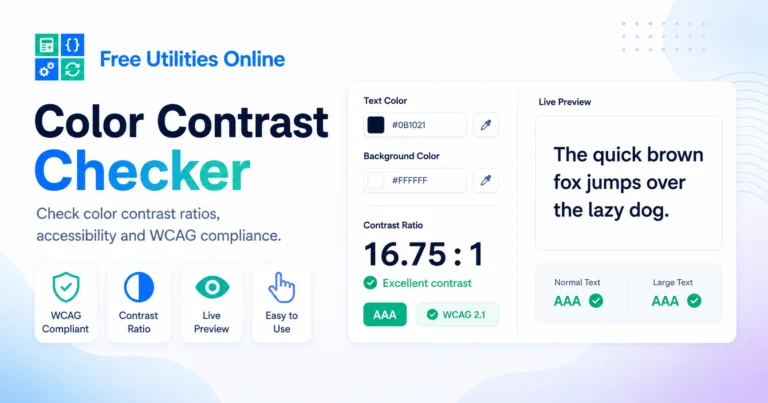
Check the contrast between text and background colors online for free. Enter two colors, calculate the contrast ratio and see whether your color pair is readable for normal text, large text and interface elements.
Use this color contrast checker to test website colors, UI components, buttons, cards, landing pages, brand palettes and CSS color combinations before using them in your design.
Choose colors
Check text and background contrast for readability.
Text color
Background color
Contrast preview
Live readability preview and WCAG-style results.
Accessible suggestions
Click a suggestion to apply it to the current color pair.
Saved pairs
Recent and favorite contrast pairs are saved locally in this browser.
Recent pairs
Favorite pairs
Export contrast CSS
What is a Color Contrast Checker?
A color contrast checker is an online tool that compares a foreground color and a background color to calculate how readable they are together.
It helps designers, developers and content creators test whether text has enough contrast against its background. This is especially useful when choosing colors for websites, apps, buttons, forms, cards, navigation menus, dashboards and brand systems.
This tool calculates the contrast ratio between two HEX colors and shows readability results for normal text, large text and UI elements.
What can you use a Color Contrast Checker tool for?
You can use this color contrast checker to test website text, button labels, call-to-action sections, cards, hero sections, form fields, navigation elements and visual components.
It is useful for web design, UI design, accessibility checks, CSS styling, branding, color palette testing and quick design reviews.
How to use the Color Contrast Checker
Step 1: Choose a text color
Select a foreground color using the color input or paste a HEX value into the text color field.
Step 2: Choose a background color
Select a background color using the color input or paste a HEX value into the background color field.
Step 3: Review the contrast ratio
The tool automatically calculates the contrast ratio between your selected colors. A higher contrast ratio usually means the text is easier to read.
Step 4: Check AA and AAA results
Review the results for normal text, large text and interface elements. The tool shows whether your color pair passes common readability targets.
Step 5: Copy or adjust your colors
Copy the CSS values, swap foreground and background colors or use the suggested accessible alternatives to improve readability.
Common contrast targets
For normal body text, a contrast ratio of 4.5:1 or higher is commonly used for AA readability, while 7:1 or higher is commonly used for AAA readability.
For large text, a contrast ratio of 3:1 or higher is commonly used for AA readability, while 4.5:1 or higher is commonly used for AAA readability.
For interface elements such as icons, borders, controls and visual UI states, a contrast ratio of 3:1 or higher is often used as a practical target.
Common use cases
For web designers
Web designers can test text, buttons, cards, sections and page backgrounds before publishing a website or landing page.
For developers
Developers can check CSS color combinations, copy color values and use the results when building accessible components.
For UI and product design
UI designers can test interface colors for dashboards, apps, forms, menus, alerts, labels and visual states.
For branding projects
Brand designers can test whether brand colors work well together in digital interfaces and readable text layouts.
For content creators
Content creators can check color combinations for social media posts, thumbnails, presentations and visual templates.
Related tools
Frequently Asked Questions
Is this Color Contrast Checker free?
Yes. This online color contrast checker is completely free to use.
Is my color data stored?
No. The tool runs directly in your browser. Your selected colors are not uploaded, saved or stored.
What does contrast ratio mean?
Contrast ratio compares the brightness difference between a foreground color and a background color. Higher ratios usually mean better readability.
What contrast ratio is good for normal text?
A contrast ratio of 4.5:1 or higher is commonly used for AA normal text readability. A ratio of 7:1 or higher is commonly used for AAA normal text readability.
What contrast ratio is good for large text?
A contrast ratio of 3:1 or higher is commonly used for AA large text readability. A ratio of 4.5:1 or higher is commonly used for AAA large text readability.
Can I check HEX colors?
Yes. You can paste HEX color values or use the visual color inputs.
Can I swap text and background colors?
Yes. You can swap foreground and background colors with one click.
Can I copy the CSS values?
Yes. The tool generates CSS-ready color values that you can copy and use in your stylesheet.
Explore more design tools
Need more visual utilities? Explore our free design tools to pick colors, generate palettes, create gradients, design shadows, build CSS buttons and generate modern interface effects faster.