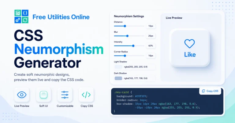
Free Online CSS Neumorphism Generator Tool
Generate neumorphism CSS online instantly with this free CSS Neumorphism Generator. Use the tool below to create soft UI cards, buttons, shadows, pressed effects and neumorphic components for your website or app interface.
Neumorphism settings
Create soft UI elements with raised, pressed, concave and convex neumorphic shadows.
Neumorphism controls
Adjust surface color, light direction, shadow distance, blur, radius and intensity.
Live preview
Preview your soft UI effect on different component shapes.
Generated CSS
14px 14px 32px rgba(148, 163, 184, 0.55), -14px -14px 32px rgba(255, 255, 255, 0.90)Saved neumorphism presets
Recent and favorite neumorphism presets are saved locally in this browser.
Recent presets
Favorite presets
What is a CSS Neumorphism Generator?
A CSS Neumorphism Generator is an online tool that helps you create soft UI effects with CSS. Instead of writing shadow values manually, you can adjust the background color, shadow distance, blur, intensity, border radius and inset effect visually, then copy the generated CSS code.
Neumorphism, also called soft UI, is a design style that uses subtle highlights and shadows to make elements look raised from or pressed into the background. It is commonly used for cards, buttons, toggles, form controls, dashboards, app interfaces and modern UI components.
This CSS Neumorphism Generator runs directly in your browser, making it fast and simple to create neumorphic CSS without installing software.
What can you use it for?
You can use this online neumorphism generator to create soft UI cards, neumorphic buttons, raised panels, pressed controls, inset input fields, dashboard widgets, app-style containers, icons, toggles, sliders and modern interface components.
For example, you may want a soft raised card on a light gray background, a pressed neumorphic button, an inset search input, or a subtle soft UI panel for a dashboard layout.
How to use the CSS Neumorphism Generator
Step 1: Adjust the neumorphism effect
Use the controls to change the background color, shadow distance, blur amount, intensity, border radius and shadow style.
Step 2: Preview the soft UI style
Check the live preview to see how the neumorphic element looks. Adjust the values until the raised, pressed or inset effect matches your design.
Step 3: Copy the CSS code
Copy the generated neumorphism CSS and paste it into your stylesheet, component, page builder, theme or frontend project.
Neumorphism CSS options
This CSS Neumorphism Generator can help with common soft UI design tasks such as:
- Generate neumorphism CSS
- Create soft UI components
- Create neumorphic cards
- Create neumorphic buttons
- Create raised UI effects
- Create pressed UI effects
- Create inset shadow effects
- Adjust shadow distance
- Adjust shadow blur
- Adjust shadow intensity
- Adjust border radius
- Adjust background color
- Generate light and dark shadows
- Preview neumorphism effects live
- Generate clean CSS code
- Copy neumorphic CSS instantly
- Create modern dashboard panels
- Create soft form controls
- Use the tool without installing software
The final CSS output may depend on the values you choose, the background color, the element size and how the generated code is applied in your project.
What is neumorphism in CSS?
Neumorphism is a UI design style that makes elements appear softly raised from or pressed into the background. It usually combines a matching background color, a light highlight shadow and a darker shadow to create depth.
The most important CSS property for neumorphism is usually box-shadow. By combining two shadows in opposite directions, you can create the illusion of a soft object sitting on the surface.
Neumorphism works best when the element background and page background are very similar. If the contrast is too strong, the effect may look more like a normal shadow instead of soft UI.
Common neumorphism CSS example
A simple neumorphic card may use a soft background, rounded corners and two opposite shadows.
.neumorphic-card {
  background: #e0e5ec;
  border-radius: 24px;
  box-shadow: 12px 12px 24px #bec3c9,
              -12px -12px 24px #ffffff;
}
You can customize the color, blur, distance and radius depending on the style you want to create.
Pressed neumorphism CSS example
A pressed or inset neumorphic effect uses inset shadows to make the element look pushed into the background.
.neumorphic-inset {
  background: #e0e5ec;
  border-radius: 24px;
  box-shadow: inset 8px 8px 16px #bec3c9,
              inset -8px -8px 16px #ffffff;
}
This style is often used for active buttons, input fields, toggles, search bars and selected states.
Main neumorphism properties
Background color
Neumorphism usually works best when the element background matches or closely matches the page background.
background: #e0e5ec;Box shadow
The box-shadow property creates the raised or pressed effect. A darker shadow and a lighter shadow are usually combined.
box-shadow: 12px 12px 24px #bec3c9,
            -12px -12px 24px #ffffff;
Border radius
Rounded corners help create the soft UI look and make the component feel smoother.
border-radius: 24px;Inset shadows
Inset shadows create a pressed effect inside the element.
box-shadow: inset 8px 8px 16px #bec3c9,
            inset -8px -8px 16px #ffffff;
Raised vs pressed neumorphism
Raised neumorphism
A raised neumorphic element looks like it is lifted from the surface. It usually uses a darker shadow on one side and a lighter highlight on the opposite side.
Raised effects are useful for cards, buttons, panels, icons and dashboard widgets.
Pressed neumorphism
A pressed neumorphic element looks like it is pushed into the surface. It usually uses inset shadows.
Pressed effects are useful for active buttons, selected states, inputs, toggles, sliders and search fields.
Both styles can be useful in the same interface when used carefully.
Neumorphism design tips
Keep the background subtle
Neumorphism works best with soft neutral backgrounds such as light gray, off-white or muted dark tones.
Use enough contrast for text
Soft UI effects can look beautiful, but text must remain readable. Make sure labels, icons and buttons have enough contrast.
Avoid using neumorphism everywhere
Too many soft shadows can make an interface feel heavy or hard to scan. Use neumorphism for selected components or decorative UI sections.
Test accessibility
Neumorphic designs can have low contrast. Always test buttons, forms and interactive elements to make sure users can understand what is clickable.
Use consistent shadow values
Keep shadow distance, blur and radius consistent across your UI to make the design feel intentional.
Combine with simple layouts
Neumorphism works best when the interface is clean, minimal and not too visually crowded.
Neumorphism vs glassmorphism
Neumorphism
Neumorphism uses soft shadows and similar background colors to make elements look raised or pressed into the surface.
Glassmorphism
Glassmorphism uses transparency, blur, borders and layered depth to create a frosted glass effect.
Neumorphism feels soft, tactile and surface-based. Glassmorphism feels translucent, layered and glass-like. Both styles can be modern, but they create very different visual effects.
Neumorphism vs regular box shadow
Regular box shadow
A regular box shadow usually creates a clear shadow behind an element, making it appear above the page.
Neumorphic shadow
A neumorphic shadow usually combines a light shadow and a dark shadow on a matching background. This creates a softer and more subtle surface effect.
If you want a standard elevated card, use a normal box shadow. If you want a soft UI raised or pressed effect, use neumorphic shadows.
Common neumorphism use cases
For cards
Create soft UI cards for features, pricing tables, product previews, blog cards, dashboards and profile sections.
For toggles and sliders
Create soft switches, sliders, range controls and selected states with raised or inset shadows.
For buttons
Generate neumorphic buttons, pill buttons, pressed states, active states and soft CTA elements.
For login forms
Create inset input fields, search boxes, textareas, select fields and soft form containers.
For icons
Apply neumorphic styles to icon buttons, circular controls, app icons and small UI actions.
For dashboards
Use neumorphism for dashboard widgets, analytics cards, stat panels, controls and app-style UI blocks.
Related tools
Frequently Asked Questions
Is this CSS Neumorphism Generator free?
Yes. This CSS Neumorphism Generator is completely free to use.
Do I need to install anything?
No. You can generate neumorphism CSS directly in your browser without installing software.
What is neumorphism?
Neumorphism is a soft UI design style that uses subtle shadows and highlights to make elements look raised from or pressed into the background.
What CSS property is used for neumorphism?
The main property is usually box-shadow, often combined with background and border-radius.
Can I create neumorphic buttons?
Yes. You can generate CSS for neumorphic buttons, raised buttons, pressed buttons and active states.
Can I create inset neumorphism?
Yes. Inset shadows can create a pressed or recessed effect for inputs, toggles and active buttons.
Can I adjust the shadow intensity?
Yes. You can adjust values such as shadow distance, blur and intensity to control how strong the effect looks.
Can I copy the generated CSS?
Yes. After creating your soft UI effect, you can copy the generated CSS code and use it in your project.
Can I use this with WordPress or Elementor?
Yes. You can copy the generated CSS and use it in WordPress, Elementor, custom CSS fields, blocks, themes or frontend projects.
Does neumorphism work on dark backgrounds?
Yes. Neumorphism can work on dark backgrounds, but the shadow and highlight colors must be adjusted carefully.
Is neumorphism good for accessibility?
Neumorphism can be visually subtle, so it is important to test contrast, focus states and interactive elements for accessibility.
Can I use neumorphism with border radius?
Yes. Neumorphism usually works well with rounded corners, especially on cards, buttons and soft UI panels.
Explore more CSS tools
Need more CSS utilities? Explore our free design tools to create glassmorphism effects, gradients, border radius values, box shadows, buttons, responsive values, grid layouts, flexbox layouts and modern UI styles faster.